W3.CSS Images
Displaying Images
Rounded Corners:

Circle:

Bordered:

Rounded Image

The w3-round class adds rounded corners to an image:
Circled Image

The w3-circle class shapes an image to a circle:
Bordered Image

The w3-border class adds borders around the image:
Hoverable Image

The w3-hover-opacity class adds transparency to the image on mouse-over:
Image as a Card
Wrap any of the w3-card-* classes around the <img> element to display it as a card (add shadows):

Simon
The boss of all bosses
Another Card Example
Example
<div class="w3-card-4 w3-light-grey">
<div class="w3-container
w3-center">
<img src="img_avatar4.png"
alt="Avatar" class="w3-circle">
<h5>example@email.com</h5>
<input class="w3-input w3-border" type="text" placeholder="Password">
<button class="w3-btn w3-btn-block w3-green">Login</button>
<a
href="#" class="w3-left w3-text-green">Forgot password?</a>
</div>
</div>
Try It Yourself »
Image Text
Position the text in an image with the w3-display-classes:

Top Left
Top Right
Bottom Left
Bottom Right
Example
<div class="w3-display-container">
<img src="img_lights.jpg"
alt="Lights">
<div class="w3-display-topleft w3-container">Top
Left</div>
<div class="w3-display-topright w3-container">Top
Right</div>
<div class="w3-display-bottomleft w3-container">Bottom
Left</div>
<div class="w3-display-bottomright w3-container">Bottom
Right</div>
<div class="w3-display-middle w3-large">Middle</div>
</div>
Try It Yourself »
Constructing a Photo Album
In this example we use the W3.CSS Responsive Grid system to create a photo album that looks good on all devices. You will learn more about this later.
Summer 2015
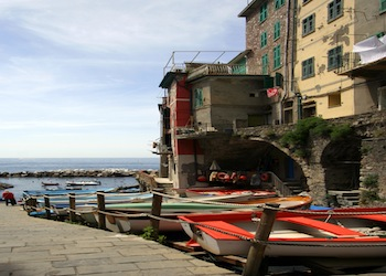
5 Terre
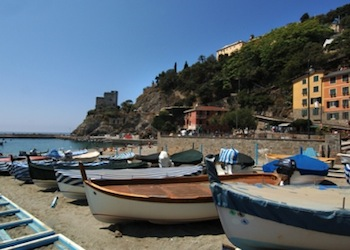
Monterosso
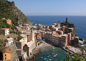
Vernazza

Manarola

Corniglia
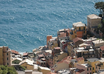
Riomaggiore
Example
<div class="w3-third">
<div class="w3-card-2">
<img src="img_monterosso.png" style="width:100%">
<div
class="w3-container">
<h4>Monterosso</h4>
</div>
</div>
</div>
Try It Yourself »

